Visualistan: Design -->

    Social Items


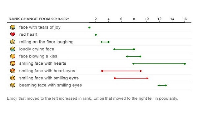
Adobe is finally rolling out its latest AI-powered features to Adobe Express after having tested them in beta for several months now. These tools are part of Adobe’s Firefly generative AI model that has been developed to assist people in the work of designing, such as creating graphics and posters, editing videos, decorating PDFs, etc.


The latest version of Adobe express is available on desktop for free and its premium plan that offers additional exclusive features costs $9.99 a month.

Adobe Brings its Latest AI-Powered Designing Features to Adobe Express


Microsoft is making its AI-powered graphic designing app ‘Designer’ a part of its Edge browser, where it can be used to design social media posts. The app is also being updated with new creative features.


Designer’s AI-powered creative tools can work to help users produce creative social media posts on Edge - you could think of it as an AI version of Canva. The app, like other AI-powered tools, is capable of producing images from text prompts. Once it generates the results, it can then work with them on different projects like invitation cards, greeting cards, pamphlets, social media posts, etc.


Users will be able to access Designer from Edge’s sidebar and create social media projects to post on platforms in the same window. This will make the process simpler by removing the need to download extensions.

Microsoft is Bringing Designer to Edge to Assist Users in their Social Media Projects


Adobe has released a new AI-powered tool that helps make quick adjustments to the colour palette of vector-based images. All you need to do is upload your Scalable Vector Graphics (SVG) files, then provide prompts using text descriptions either by typing them out or choosing one of the sample prompts from the list.


SVG files can be distinguished from JPEG or PNG images based on their capacity to be scaled to any size without compromising quality. This makes them an ideal choice of images for graphic designers or illustrators whose work require frequent resizing of images.

Adobe Releases an AI Vector Recolouring Tool that Switches up Colour Schemes in Images


People have been experimenting with ChatGPT’s functions and getting creative with their usage of the technology ever since its arrival. In one of such experiments, a designer and blogger named Matt Webb ended up developing a clock that tells the time in two-line poems that it composes using ChatGPT.


Explaining how the product came into being, Webb says that it evolved from a regular text clock that he had created using Inky wHAT screen and a Raspberry Pi. After exploring several of OpenAI’s language models for some time, Matt decided to combine the two creations. As a result, the new AI powered clock uses OpenAI’s API to give a single prompt to ChatGPT, which in turn generates a poem. These poems are not generated from a pre-set catalogue, which means that a new text appears each time.


Designer Matt Webb Develops a ChatGPT-Powered Clock that Tells Time in Poems


A new interesting option called Edit Grid is being tested by Instagram for the profile photo grid, which would allow users to rearrange posts in their profile grid.


Social media expert, Alessandro Paluzzi, discovered the latest option in the profile settings. Using the option, users would be able to move around posts in their grid however they like, regardless of the original order of the posts.


Instagram is Testing a New ‘Edit Grid’ Option for Profile Grid


The Unicode Consortium revealed statistics of the top 10 most used emojis of 2021 and guess which one made it to the top? Of course the tears of joy emoji; the world’s most favorite. What’s more interesting to note is that the emoji has been on top since 2017.


The Unicode Consortium further revealed that there hasn’t been much change seen in the top 10 emoji list between the past two years, except that the two hearts emoji and the smiling face with three hearts emoji swapped places in the list.

The Top Most Used Emojis of 2021 Have Been Revealed


A new set of app icons has been discovered in the backend code of Twitter’s app, based on the theme of seasonal celebrations and festivities.


The feature of themed icons is offered by Twitter Blue, which is Twitter’s subscription program that allows some of the platform’s dedicated users to get access to a variety of additional features.


One of the latest features offered by Twitter Blue includes the Undo Tweet option that allows users to retract a tweet within 30 seconds of sending it, to edit any errors. The Reader Mode and Bookmark Folders are also part of the offer, although there isn’t anything that extraordinary about them.

Twitter Blue is Offering Seasonal and Holiday Themed App Icons


Microsoft has dedicated a lot of its efforts to redesigning Skype several times over the years, and the company is back at it with the latest Skype update, which is currently in development. According to Microsoft, it is working on an “improved, faster, reliable, and super modern-looking Skype” and plans to launch the changes in a few months.


According to the preview of Skype’s new look as shared by Microsoft, the most important update is that of the call grid. The grid will now include all the participants on a call who will appear side by side, while your own video will be displayed in the main interface. Participants who would not have their video enabled will be shown in the grid too.


Next, the main calling interface of Skype is getting more customizable with options of new themes and layouts. These include options of speaker view, grid view, large gallery, Together Mode, and content view. Moreover, users will be able to choose from new colorful themes with button gradients, an improved side panel on mobile, and Fluent Design icons throughout the apps.

Microsoft is Working on Releasing Yet Another Improved Version of Skype


Since the past year, Google has made quite some changes to its office and communications software suite, Workspace. One of these changes includes a major one that the company recently announced, which is the redesigning of Gmail.


The redesigning of Gmail includes the option to “ring” a person with Google Meet, within the Gmail app. This means that users will be able to use Gmail for placing calls, and according to Google, the feature will come to the Meet app in the future too.


By placing greater emphasis on Gmail, Google seems to be showing how important of a service it is when it comes to the company’s Workspace. In a way, Gmail is now Google’s equivalent to Microsoft’s Outlook, as it has become a hub for multiple services like email, one-on-one chats, group chats, videoconferencing, and even calls now.


Google is also making it easier to find Spaces, Gmail’s group chat feature, by allowing users to search for it as an option, and also adding full support for threaded messages.

Google is Turning Gmail into A Multi-Service App


Twitter just announced that it is working on edge-to-edge media in tweets for its iOS version. This layout will provide users with a full screen experience of videos and photos in their Twitter timeline, which closely resembles the layout of Instagram.


Twitter also explained the purpose behind the design of the new look, which is to enhance both visual and text-based conversations on the platform. The feature also fixes the issue of cropped images in conversations; something that Twitter users have always complained of.


On the other hand, some users don’t seem to be quite content with the social company’s new design layout. Some concerns suggest that the edge-to-edge screenshots of tweets can cause confusion, as people may take them for actual tweets.

Twitter is Testing a New Layout with Edge-to-Edge Picture and Video


Twitter is experimenting with a new layout for timeline, which closely resembles the layout of Instagram. The layout shows photos stretched to the edge of the display instead of the horizontal margins on either side of them that can be seen in the platform’s current layout.


Social media expert Jane Manchun Wong spotted Twitter’s new design layout and shared a screenshot of it.


Twitter Considers a New Timeline Layout


Twitter is revamping its TweetDeck platform, that provides an easy-to-read format of lists and feeds. The TweetDeck app was launched 12 years ago and Twitter acquired it in 2011, and ever since, the app has never received any major changes in its features or design. After all these years, it seems like Twitter is finally focusing on bringing some updates to the app.


According to Twitter’s product chief Kayvon Beykpour, he and the product team is actively working on updating the TweetDeck project, that they intend to show off later this year. “We’ve been working on a pretty big overhaul from the ground up of TweetDeck, and it’s something that we’re excited to share publicly sometime this year,” Beykpour said.

Twitter to Revamp the TweetDeck App


Amazon’s new app icon that made its first appearance back in January, has started to look a little different. The icon previously appeared to show a tape that looked like a toothbrush-style moustache, which has now changed.


The toothbrush-style moustache became a popular trend after being famously associated with comedian Charlie Chaplin and later with Nazi dictator Adolf Hitler.


Amazon changed the initial look of its app icon after receiving feedback from its customers. “Amazon is always exploring new ways to delight our customers. We designed the new icon to spark anticipation, excitement, and joy when customers start their shopping journey on their phone, just as they do when they see our boxes on their doorstep,” said an Amazon spokesperson about the recent tweak to the app icon’s design.

Amazon Changes its App Icon Design after Receiving Customer Feedback


Reddit is working on redesigning its entire site for Android users with new features. The overall look of Reddit for Android would appear more sophisticated and simple now. Reddit did the same revamp for iOS and mobile web users last year and is now making it available for Android users starting from this month.


The icons on the revamped Reddit website would stand out more, with the colors giving it a nicer look. Unnecessary tools and information have been removed, which would make the site appear less cluttered.


One noticeable change is that the Daily Digest mails of Reddit will now show more information about other posts and images. The informational page for Reddit premium users will also features new options, as well as custom built application icons.

Reddit Redesigns its Site for Android Users with New Features and a Better Look

The Most Popular Interior Design Styles in America in 2020

Owning, designing, and updating the interior of your home is one of the great joys as homeowner. Many Americans have used the extra time spent at home during the COVID-19 pandemic to update parts of all of their homes. After all, with all the extra time spent at home, it is as important as ever to really enjoy your home and where you live. Spending the time to update or redo the interior of your home can do wonders to how you feel during the COVID-19 pandemic. 


Many Americans are inspired to update their home as a result of the things they see on social media (Pinterest, Facebook, Instagram, etc..) as well as television shows, interior design magazines and what they see in the homes of their close family and friends. This got us wondering more about whether or not interior design trends differ by state and what the overall interest in interior design has been like during 2020 and during the COVID-19 pandemic. 

The Most Popular Interior Design Styles in America in 2020 #Infographic


Microsoft is planning to design a visual rejuvenation of Windows. The company indirectly revealed its plan through a job listing where it advertised for a role of software engineering in the Windows Core User Experiences team.


The job listing post read “On this team, you’ll work with our key platform, Surface, and OEM partners to orchestrate and deliver a sweeping visual rejuvenation of Windows experiences to signal to our customers that Windows is BACK and ensure that Windows is considered the best user OS experience for customers.”


However, the company removed references to the Windows rejuvenation after the ad post sent a wave of excitement for a number of Windows enthusiasts.


Microsoft is Ready to Introduce a “Sweeping Visual Rejuvenation” of Windows


Apple opposed a trademark application by the creators of Prepear, a recipe and meal-planning app, back in August. The company claimed that Prepear’s logo was similar to Apple’s own logo.


According to Apple, Prepear's logo consisted of a “minimalistic fruit design with a right-angled leaf, which readily calls to mind Apple's famous Apple Logo and creates a similar commercial impression."


This was followed by Prepear’s parent company Super Healthy Kids launching a petition to convince Apple to drop its opposition. The petition has gained over 250,000 signatures by now.

Apple and Prepear may be Negotiating for a Settlement for the Logo Dispute


At its annual developer conference in China, Vivo just announced its new Android based OS called OriginOS. The new operating system has been designed to mainly focus on widgets that are arranged in a grid-like layout and can update themselves with ‘'nano alerts’' notifications.  


According to Vivo, the OriginOS has been developed keeping in mind three main factors: design, smoothness and convenience. The previously functioning OS of Vivo was called FuntouchOS.  


OriginOS’ design sort of resembles Apple’s newly launched iOS 14, as the iOS 14 also features a grid-like display of widgets. Vivo’s actual inspiration for OriginOS’ layout is, however, more unique: Huarong Dao, the Chinese variant of Klotski sliding block puzzles. 

Vivo Announces New Android Based Operating System: OriginOS


Apple just revealed its new iPhone 12 lineup, the most prominent feature of which is the new ceramic hardened display. The new display goes by the name of Ceramic Shield and it is part of iPhone 12, iPhone 12 mini, iPhone 12 Pro, and iPhone 12 Pro Max. 


The Ceramic Shield, according to Apple, has 4 times greater resistance towards damage from drops and is tougher than any glass display of a smartphone.  


Glass ceramic isn’t a material that only Apple has incorporated in its smartphones, but The Essential Phone, Xiaomi’s Mi Mix series, and Samsung’s Galaxy S10 Plus have ceramic panels too. The only difference is that these handsets have the material incorporated only in the rear part of the phone. Apple, on the other hand has taken the innovation a step ahead by using glass ceramic for the display of its iPhones, which contributes to greater utility for customers, as anyone would be more concerned about protecting their phone’s screen more than its rear.  

Apple Introduces Ceramic Hardened Display as Part of the New iPhone 12 Lineup


Apple’s latest OS for iPhone, iOS 14, allows users to create personalized home screens. Users can even create custom app icons using the Shortcuts app, which serves as an intermediary between themed icons that can be created and the apps linked to them. Designer Doney Den Ouden has launched a collection of unique custom app icons called Bold, which is giving a fresh, new look to the iPhone app icons.


Majority of the stock icons in iOS 14 were last updated 7 years ago with iOS 7, and their design has therefore become outdated as the latest design language of iOS is completely different, with bolder typography and rounded icons that give off a more aesthetically pleasing look.  

The ‘Bold’ App Icon Set is Giving iOS 14 Users a Fresh New Look to their Home Screen

Subscribe Our Newsletter