Rebranding is a tricky maneuver, but it can yield a strong payoff if positioned correctly. The team at LogoMaker explores the most successful logo redesigns in terms of web traffic increases. They compared company website traffic before and after the release of their new logo and gave us the 35 logo re-makes that drew the most attention. The results show a wide variety of industries, from professional sports to leading credit card companies to airlines to pharmaceutical companies. The graphic shows both the old and new logos so curious designers can take in the redesign’s details and see how they reflect changing tastes or a company’s new message. This is a fascinating graphic in terms of the power of a visual representation of a brand. In some cases, current events might have influenced a brand’s population. In others, the new logo might have come with other refreshing changes to breathe new life into a company.
Rebranding is a tricky maneuver, but it can yield a strong payoff if positioned correctly. The team at LogoMaker explores the most successful logo redesigns in terms of web traffic increases. They compared company website traffic before and after the release of their new logo and gave us the 35 logo re-makes that drew the most attention. The results show a wide variety of industries, from professional sports to leading credit card companies to airlines to pharmaceutical companies. The graphic shows both the old and new logos so curious designers can take in the redesign’s details and see how they reflect changing tastes or a company’s new message. This is a fascinating graphic in terms of the power of a visual representation of a brand. In some cases, current events might have influenced a brand’s population. In others, the new logo might have come with other refreshing changes to breathe new life into a company.
There are many aspects to consider when designing brand messaging. One of the most important visual aspects to a brand is the logo. It needs to be instantly recognizable and evoke certain feelings and associations. The most powerful tool to accomplish these things is the choice of color.

Twinings, a British tea company, currently has the oldest logo that's been in continuous use without alterations to the company's logo design. In fact, the logo for Twinings was created way back in 1787, and is actually based on the family crest, while also referencing China, which is where Twinings exclusively sourced their tea.

When starting a brand, creating a logo will quickly take a backseat in light of the pressing challenges ahead. But interestingly, logos define a brand and command more value than the brand itself! People may think that they do not need a logo right now or push it off to deal with it at a later phase. That inner voice couldn’t be more wrong—the success of a brand depends on its logo, in part. The second pillar of success is, of course, the products, word-of-mouth, and referrals.
Why Are Logos Important?
They attract people, create a much-needed strong impression, and establish the brand identity. It sets you apart from the competition and builds brand loyalty. These seven points below will explain why logos are in fact so important:
1. It Captivates Attention
In this day and age, attention spans are a lot shorter. The consumers have a lot to do, let alone remember. Companies have only 2 seconds to convert customers, while long-term retention is a separate challenge for them. This is where the logo comes in—it puts the consumers front and center and communicates the brand’s core values. It captures that short window of opportunity for the brands to bring in new consumers. That is why a strong logo can represent the brand globally. For example, McDonald’s golden arches are more recognized than the Christian cross.
2. It Establishes Brand Identity—and more
Successful branding is all about telling a story to evoke consumers’ emotion—it’s been the calling point for brands for decades.
While it’s true that a corporate logo is a part of the brand, it also plays a crucial role in communicating the brand image and narrative. Companies capitalize on it and thrive on it for years.
A lot goes into a logo—font, tones, and colors. The logo establishes the brand feel and sets the stage for any compelling story. The elements of the logo—later on—will be a part of the branding material—landing pages, business cards, letterheads, and more. Consequently, the brand takes a life of its own.
3. A High Recall Value
Logos establishes identity, and customers use it to associate with your brand. Many leading brands miss out on how their logo triggers emotions among their consumers—they should put two and two together. A logo should speak to them and create feelings they can’t let go.
Simply put, a logo should be an aesthetically-pleasing visual and stir positive thoughts of the brand.
In all honesty, consumers face information overload—can’t blame them. They are likely to forget the name of a business in a sea of competitors (it’s human nature and nothing against the brand). Yet, a logo with high recall will undoubtedly keep the brand in people’s minds.
4. Creates Brand Loyalty
Consumers crave consistency. When a brand grows, the logo becomes a symbol of association for customers far and wide. It creates and builds trust and accessibility.
From time to time, leading brands redesign their logo for various reasons. This could
reflect a corporate change or a shift in the brand image. For marketers it might be a good
strategy but not as much for consumers. Consumers have to retrain their minds to recall a
new logo, and others feel a bit betrayed. Brand loyalty is vital for every emerging and
established business. A familiar and recognizable logo can play a huge role in brand
loyalty.
Once the brand establishes itself in the consumers’ minds, they will seek the brand
themselves and the logo will lead the way.
McDonald’s and Nike haven’t changed their logo in decades—just some food for
thought.
5. Invites New Customers
Interesting colors and designs intrigue people. A logo is a sales pitch of sorts to attract customers and entice them to purchase something. The logo should appeal to their interests and intrigue people enough to at least make them want to see more.
6. The Audience Expects it
The logo is the first thing customers will look for when they see marketing
communications from your brand. It has to be the center of all the marketing
material—flyers, business cards, and more.
7. Stand out From the Crowd
With a market cluttered with competitors—you need an edge over them, something to make you stand out. You can distinguish yourself with a great logo and do the consumers a favor as well. Yes, there are over 40 coffee shops in your metropolitan city. But you are the only one with the eco-friendly logo and sustainable practices—you are great for the environment. The earthly logo will be a calling card for the consumers.
A detailed corporate logo establishes everything about your brand—brand image, brand feel, customer-friendly outlook, company’s background, mission and vision, and then some. In other words, the logo talks to the customers about your values and shows them how you are different from everyone—you are the best of the lot.
Takeaway for Readers
And, there you go! While building a brand, a logo is a vital part of the skyscraper that your brand will become one day. For this, a new business requires a suite of branding and logo toolkit to get started. The finished product will project the best image of the brand for the audience. Come on, put your best foot forward.
Are you ready to create your own logo and build brand recognition? Get in touch for more information.

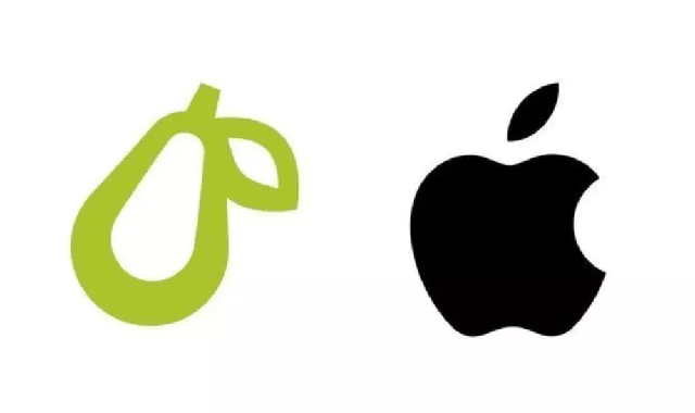
Apple opposed a trademark application by the creators of Prepear,
a recipe and meal-planning app, back in August. The company claimed that
Prepear’s logo was similar to Apple’s own logo.
According to Apple, Prepear's logo consisted of a “minimalistic
fruit design with a right-angled leaf, which readily calls to mind Apple's
famous Apple Logo and creates a similar commercial impression."
This was followed by Prepear’s parent company Super Healthy Kids launching a petition to convince Apple to drop its opposition. The petition has gained over 250,000 signatures by now.


As claimed by Apple, a meal prep company Prepear app’s logo look-alike Apple’s own logo. The Prepear app’s cartoon logo is a green coloured pear itself which resembles the “Apple” of Apple’s logo. Apple recently filed an opposition notice in the aforementioned regard. Apple also claims that this will make it hard for users to distinguish between Apple’s and Prepear’s products and services, which also kind of violates the Lanham Act.
A petition has been started by the co-founder of Prepear Russell Monson with the slogan “Save the Pear from Apple!”. Around 14,000 people have already signed the petition. Monson also says that Prepear is a very small company which cannot afford a battle with a tech giant like Apple. The court filing by Apple also says that Prepear offers similar services as Apple. Hence, any service or good by Prepear can make the consumers think that it is Apple’s product.


A logo is the face of a company, and hence it is essential
to have a meaningful and robust logo. Companies often make a mistake of getting
their logo wrong, which results in less consumer interaction. Many companies
choose simplicity and minimalism, and others like clutter and bold designs. It
depends on the nature of the company a logo is representing.

A good logo not only catches attention for all the right reasons, but is also functional and visually appealing. Logo designs have evolved through history to reflect contemporary design trends, and many large corporations have followed suit in updating their logos as time has gone by.
This infographic focuses on some of the visual elements and design trends that are currently popular in logos. The basic elements such as line of sight, typography, colour and layout of the logo play a huge role in conveying your brand’s image and the overall aesthetic of your company.

A brand is recognized by its logo. The more decent it is, the better it is for the consumers. A company's logo mustn't be ambiguous, but it should be creative because a logo is the face of a company. Many brands adopt a stylish look; meanwhile, some brands choose simplification. It depends on the nature of your company and how its logo should be designed.
In the last ten years, the trend for logo designing has
changed quite drastically, and there are a lot of logos that are considered old
school if anyone sees them in a logo.
Simplify your brand
Simplicity has been a very reliable choice for many brands
now. The culture died down in the last two decades, but it is back and making a
statement. Companies like Uber, Yahoo, and Facebook have adopted simplicity
now. Minimalistic design always looks elegant.
Shaping it up
Geometrical shapes in the company's logo are always
creative. They create a sense of creativity as well as represent the company in
a positive light.
Typography
Typography is a form of art that is also trending as logo
designs in 2020. There has been a lot of creative yet simplifying company logo
designs with nothing else but using typography. There are a lot of types of
typography that you may want to adopt that suits your company.
Style and clutter
Cluttering a logo with style has been around for a long time
now. However, it is a hard craft to master. Too much clutter causes a mess that
does not stand right with the company, but with the right design, it can look
fancy and exciting at the same time.
Shades of different colors
If you want to breathe some life into your simple logo, you
may want to add some colors to it. Gradients are always a good idea to make a
logo interesting.
Emblems
Ever since Starbucks created an emblem logo, it has been in
trend. Emblems are not usually simplified or minimalistic because of the
clutter, but they do look strong if designed correctly.

Share This Infographic On Your Site


You are excited about starting your business, and everyone
you have talked to has liked your idea, and you know it will be a huge success.
But as marketing is a place full of competition, you have to make your product appealing and
unique. According to marketing experts, brand identity is the main thing to
make or break your business.
Brand identity is essential as to how a company wants to see
its product in the market place. Therefore companies


Logos history can be traced back to prehistoric symbolism, Egyptian hieroglyphs, branding of livestock and early family crests. Commercial branding is believed to have originated likely with the practice of branding livestock to deter theft.
Depictions of cattle branding have been found in ancient Egyptian tombs dating back to 2,700 B.C.E. Over time, consumers (and creators) realized that a brand provided information about a product's origin and ownership and could help to indicate quality. Then farmers, potters, and traders started adapting the branding to mark their craftsmanship.
Subscribe to:
Posts (Atom)