Web design is constantly evolving, shaped by technology, user expectations, and business needs. A well-designed website isn’t just visually appealing—it also enhances user experience, improves engagement, and drives conversions. Let’s explore modern web design principles and emerging trends that define today’s digital landscape.
Web design is constantly evolving, shaped by technology, user expectations, and business needs. A well-designed website isn’t just visually appealing—it also enhances user experience, improves engagement, and drives conversions. Let’s explore modern web design principles and emerging trends that define today’s digital landscape.
Wix, a platform that provides cloud-based web development
services, has shared a glimpse of its upcoming AI-powered features. “There are
a lot of fantastic things you should expect to see released in the next year,”
states the platform in a blogpost.
First and foremost, one of the most anticipated features,
the ‘AI Site Generator’ is soon to be released. Seeming like a game-changing
tool, Wix claims that it is capable of designing tailor-made websites using a
simple prompt from the user, incorporating designs and layouts that match their
site’s content. The tool can also be prompted to make “high-quality” changes to
a site.
Then there’s an ‘AI Page and Section Creator’ tool that will
enable a user to instantly add pages or sections to an existing website. Once the
user provides a text-based input of what they want, the tool will create the
page or section with the layout, design and text.
Another useful item is the ‘Object Eraser’ that will make it possible to extract subjects from images and manipulate them. Wix is also working on an AI Assistant for managing business that will suggest improvements for a website and generate strategies based on personalized analytics and site trends.
As the technology is advancing and many new features and
techniques are being tested and applied, the technique under spotlight in the
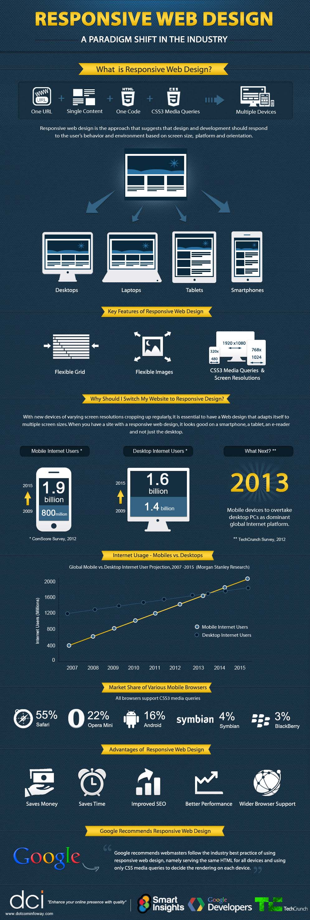
web design industry is ‘Responsive Web Design’. This infographic further explores
and provides insights on the new concept and the reasons on why it’s gaining so
much popularity.
Statistics show that the usage of internet on mobile phones
has been growing remarkably over the last few years. From 800 million mobile
Internet users in the year 2009, the count reached to 1.9 billion users by
2015. Stats also show that in the year 2009 there were 1.4 billion users of
desktop internet which only raised to 1.6 billion users by the year 2015. This shows
the great paradigm shift in the industry.
Responsive Web Design is actually a method that uses design
and development as a way to respond to the individual user’s environment and behavior
based on the platform, orientation and the screen size that they use. The key
feature of this design is flexibility so it can adjust according to the screen
type being used. Whether you use a laptop or a desktop, a tablet or a smartphone,
the flexible grid adjusts itself according to the screen size and so the images
displayed on the screen are also flexible.
Having Responsive Web Design is very significant in today’s
world. As there are plenty of different type of devices that have varying
screen resolutions, it’s essential to have a web design that can adjust itself
according to different screen sizes. The performance of this design is better as
it has wider browser support and improved SEO. Thus, it is a time saving hence
money saving technique.
Infographic by: dotcominfoway
Share This Infographic On Your Site
Do you want to build a company, community organization, business, or want to revitalize your personal online presence? Whatever the purpose, you need a website. According to official data, there are now about two billion of them functioning. The real-time online statistics counter shows that every second, a new one appears on the Internet.
This infographic will show you and teach you how to choose a web development company for your business.
Google is always working on improving its services including
the main search engine, and its most recent update includes a new real time
addition of Big Moments.
Big Moments is a feature exclusively designed for Google’s search engine, which shows news other than what is typically displayed in the website’s news box.
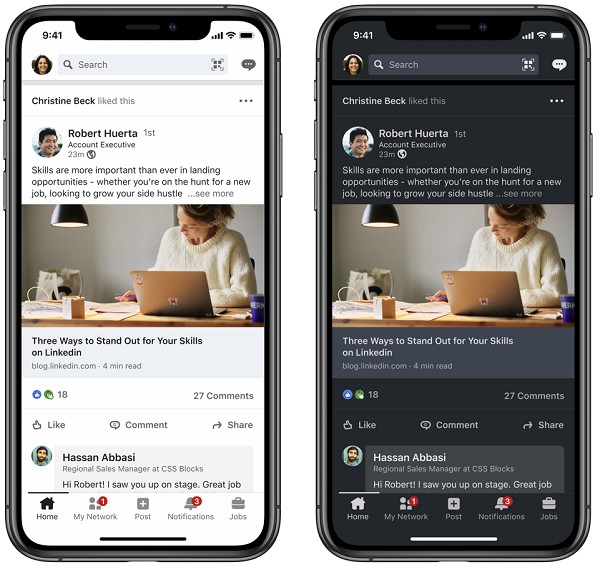
LinkedIn has finally introduced Dark Mode for its mobile and
desktop versions. Dark mode has become a popular choice among social media users as it reduces
strain on the eyes by limiting blue light exposure, and also appears cooler.
LinkedIn described two of the main elements that its Dark Mode is based on: accessibility and inclusivity. The accessibility aspect offers contrast ratios for better text legibility and user interface controls to accommodate the light to dark background contrast. The inclusivity of this feature contributes to bring together LinkedIn’s diverse communities by introducing dark mode versions of LinkedIn’s illustrations. The illustrations represent professionals of various backgrounds across LinkedIn.
Are SEO links a thing of the past? Today, 94% of all web content has no external links, but SEO experts say that’s a big mistake. Links still matter. In fact, according to a study by SEMrush, 4 of the top 8 ranking factors are based on link signals. These for our total referring domains, total backlinks, total referring IPs, and total follow-backlinks. Generally speaking, Google’s top ranking organic search result has 3.8x more backlinks and 3.2x more referring domains than those than rank numbers 2 through 10. Experts say that link building and technical optimization are still of the utmost importance in SEO tasks. According to SEO Consultant, Bill Hartzer, links from one website to another are how we navigate the web, therefore they will always be important regardless of the involvement of any algorithm.
Website development and web building are some of the most popular jobs in the world right now. Almost every business has a website and an online presence that makes it easier for them to connect with the customers. However, the more crucial web development may be, they are always started with HTML and CSS.
No matter how hard the progressive languages are, a
programmer always takes baby steps with these two languages. So, what are they?
HTML and CSS are the core languages utilized in a website to function – at least
the basic aspects of it. HTML stands for HyperText Markup Language and is
responsible for the content, structure, and placement of a webpage. CSS stands
for Cascading Style Sheets and is responsible for the designing aspect of things
as it enhances the display of HTML elements.

Mobile traffic is growing day by day. According to statista.com, 3.5 billion people use smartphones in their daily life. Today, half of the web traffic is generated by smartphones. It is believed that by 2025, 72% of all internet users will use smartphones to surf the net. Such a tendency can’t help but influence web design. What is more, for over 10 years now, Google has encouraged website masters to follow the ‘mobile-first’ approach to ensure better search results.


