Netflix is on a roll these days due to the lockdown and
everyone binge-watching their favorite tv shows. However, there is a lot more
going on behind the scenes. There is no denying that we will never run out
options for the shows to watch on Netflix. However, the way Netflix markets its
products is remarkable, and there is a bit of psychology embedded in it as
well.
Good marketers know what their audience wants. They know how a consumer selects products, and that there are various aspects from design to quality to the marketing tools used that can sway a buyer towards their product.
Fonts are however a marketing tool that are often underutilized and overlooked, not only by marketers, but also by designers. But the right font can make quite the impression on your buyer or reader (or whoever you’re targeting).
You are excited about starting your business, and everyone
you have talked to has liked your idea, and you know it will be a huge success.
But as marketing is a place full of competition, you have to make your product appealing and
unique. According to marketing experts, brand identity is the main thing to
make or break your business.
Brand identity is essential as to how a company wants to see
its product in the market place. Therefore companies
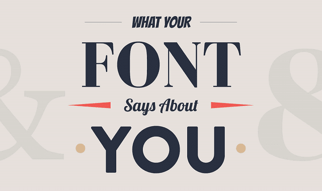
Did you ever think that the font type you choose for your logo could say something about you and your business? Or that it could convey your message in a certain light? Today’s infographic covers the psychology behind type choices.
You will learn how serif, sans serif, script, modern, and display typefaces and their fonts are best used for moving your audience to feel how you want them to feel. You should take careful consideration when choosing a logo font.
As you may already know, people have certain feelings, emotions, and associations when they see certain colors. What you may not realize is that they have a similar response to typefaces and fonts.
Fonts are one of the most crucial aspects of design. Using the right font brings order to the design and helps deliver the message without chaos or confusion. The versatility of fonts is important to keep brand's message consistent across screens. Versatile fonts adapt to their environment (in terms of size, letter spacing, thickness/thinness and orientation) to ensure that designer does not have to struggle with the content. Here are some of our favorite fonts that are not just quick to adapt but also come handy in variety of applications. Check out!
Many times, that somebody is an experienced designer. But since most of us also have to print things off now and again, the folks at Pixartprinting, an online printing service, created an infographic to explain the impact of even seemingly trivial choices, like using Comic Sans. Sure, we know that you know better than to use Comic Sans in settings outside of a lemonade stand. But did you know it also uses more ink than respectable typefaces? Or that British English speakers, despite their darling accents, waste a lot more trees with their spellings?
In today's competitive business environment, designers must be familiar with all the available fonts and how to use them to create a unique character for the company. One way savvy corporations accomplish this task is to develop a custom font and use it not only for their logo but also to market their website design and accompanying printed pieces.
Subscribe to:
Posts (Atom)


