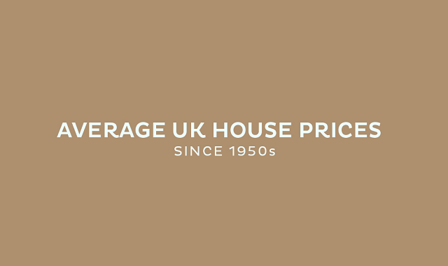

This handy infographic shows where and when house prices have increased and what the difference is now, compared with each of the past seven decades.
The best way to understand house prices and the way that they have changed over the decades, is by looking at the statistics: facts and figures never lie. While there have been some periods where house prices in the UK have stagnated or even dipped a little, as a general rule of thumb, property prices will always increase.
Over the past 7 decades, house prices have increased to an average of £230,000, well over a 100% increase in price. Imagine where house prices will be in another decade or two.
Making the decision to get onto the property ladder is one that most people really consider and don’t rush into, which they shouldn’t - after all it is an investment. But as you can see, the longer you take to buy a property, the more you are likely to have to pay for it.


Infographic by: superiorfireplaces
