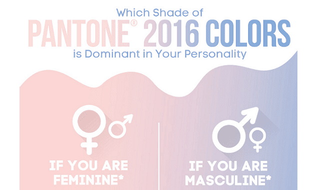
Which Shades of PANTONE 2016 COLORS is Dominant in Your Personality? #Infographic - Visualistan -->

    Social Items

Which Shades of PANTONE 2016 COLORS is Dominant in Your Personality?
This year for the first time the kingdom of colors is under a double rule - overlapping shades of warm pink and cool gray with a drop of blue. This season's most fashionable color has a therapeutic effect, soothes and restores life balance while, at the same time, giving a sense of security and comfort. Its task is to move us to places where we feel bliss, where we are at ease, and where we discover ourselves - explains Leatrice Eiseman, executive director of PANTONE Color Institute. PIXERS invites you to check which of the shades of the Color of the Year 2016 dominates in you!
For the first time PANTONE decided to select the color made up of two, though different, complementary colors:
  •  Rose Quartz, which provides a gentle tone, gives a feeling of tranquility, but it also reminds flushed cheeks, budding flowers and a cloudless sunset 
  • Serenity - is the color of the sky, bringing a feeling of relief, even in these turbulent times, giving a sense of security and bliss
PANTONE does not leave the Color of the Year in a void - experts of the institute every year create a palette of colors that perfectly complement it. So far, the presentation concerned colors for men and for women. This year, PANTONE representatives decided to abandon this division - they proposed unisex palettes(!)thus offering a greater freedom of colors selection regardless of gender.

According to PANTONE, the color of the year 2016 has inspired PIXERS - the internet shop with wallpaper and wall stickers - to prepare a special offer for its customers with the Rose Quartz and Serenity shades.

However, to facilitate the choice for each of us an infographics was created which is actually a map of associations describing these two colors in terms of their adjustment to personality.
Are you pink or blue? Test yourself and find the key to your inner self! pixers.pl.

Remember, tough, that you do not have to make a final choice if you identify with both colors. Rose Quartz and Serenity are the epitome of complementary opposites. Beautiful separately and together forming a unique duo.
Which Shades of PANTONE 2016 COLORS is Dominant in Your Personality?

Share This Infographic On Your Site

Which Shades of PANTONE 2016 COLORS is Dominant in Your Personality? #Infographic

Which Shades of PANTONE 2016 COLORS is Dominant in Your Personality?
This year for the first time the kingdom of colors is under a double rule - overlapping shades of warm pink and cool gray with a drop of blue. This season's most fashionable color has a therapeutic effect, soothes and restores life balance while, at the same time, giving a sense of security and comfort. Its task is to move us to places where we feel bliss, where we are at ease, and where we discover ourselves - explains Leatrice Eiseman, executive director of PANTONE Color Institute. PIXERS invites you to check which of the shades of the Color of the Year 2016 dominates in you!
For the first time PANTONE decided to select the color made up of two, though different, complementary colors:
  •  Rose Quartz, which provides a gentle tone, gives a feeling of tranquility, but it also reminds flushed cheeks, budding flowers and a cloudless sunset 
  • Serenity - is the color of the sky, bringing a feeling of relief, even in these turbulent times, giving a sense of security and bliss
PANTONE does not leave the Color of the Year in a void - experts of the institute every year create a palette of colors that perfectly complement it. So far, the presentation concerned colors for men and for women. This year, PANTONE representatives decided to abandon this division - they proposed unisex palettes(!)thus offering a greater freedom of colors selection regardless of gender.

According to PANTONE, the color of the year 2016 has inspired PIXERS - the internet shop with wallpaper and wall stickers - to prepare a special offer for its customers with the Rose Quartz and Serenity shades.

However, to facilitate the choice for each of us an infographics was created which is actually a map of associations describing these two colors in terms of their adjustment to personality.
Are you pink or blue? Test yourself and find the key to your inner self! pixers.pl.

Remember, tough, that you do not have to make a final choice if you identify with both colors. Rose Quartz and Serenity are the epitome of complementary opposites. Beautiful separately and together forming a unique duo.
Which Shades of PANTONE 2016 COLORS is Dominant in Your Personality?

Share This Infographic On Your Site

Related Post

Disqus Codes
  • To write a bold letter please use <strong></strong> or <b></b>
  • To write a italic letter please use <em></em> or <i></i>
  • To write a underline letter please use <u></u>
  • To write a strikethrought letter please use <strike></strike>
  • To write HTML code, please use <code></code> or <pre></pre> or <pre><code></code></pre>
    And use parse tool below to easy get the style.
Show Parser Box

strong em u strike
pre code pre code spoiler
embed

Subscribe Our Newsletter

Notifications

Disqus Logo